
XOLA EV CAR
HMI- INTERFACE DESIGN
overview
To create an HMI concept that supports the driver proactively, preventing accidents before they happen.
One part of that solution: designing experiences that help the driver stay relaxed, focused, and in control.
Role:
UX/UI- & HMI Design Student
Timeline:
April 2022 (5 weeks)
Team:
Solo Project
THE context
Cars are no longer just a way to get from A to B.
Today’s vehicles are intelligent, connected, and increasingly autonomous.
With semi-autonomous driving systems becoming common, the automotive industry faces growing demand for safer driving and personalized digital experiences.


the problem
Through research, I discovered that driver fatigue is a common cause of traffic accidents. Current autopilot technology in modern EVs is reactive; it helps drivers respond faster to hazards, but doesn’t anticipate them early enough.
my design goal
To create an HMI concept that supports the driver proactively, preventing accidents before they happen.
One part of that solution: designing experiences that help the driver stay relaxed, focused, and in control.
We began by stepping back and looking at the entire ecosystem of screens and controls inside the 900. Our first mission was to understand how all these surfaces would relate to each other, how information and interaction would flow between them.
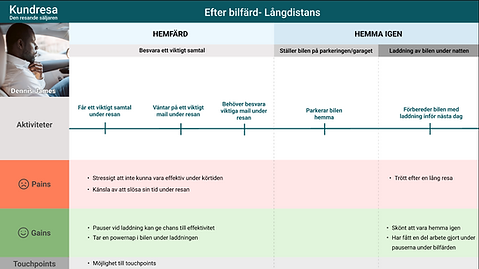
We mapped six unique user journeys, one for each passenger, exploring their potential needs, desires, and moments of delight during a drive.
Would the driver want fast climate control shortcuts without breaking focus?
Could a second-row passenger adjust ambient lighting without disrupting others? How might a child in the back watch a movie, play a game, or turn on their seat heating without needing help?
Below are the next three steps we took.
Research Process
I started the process with a How-might-we question that asked:
How do you keep the driver's focus in traffic?
I began with secondary research and did broad searches on relevant topics.
How long do you drive the longest in your everyday week? (one way)

How old are you?

I created a survey that received 257 participants (4 were interviewed for deeper insights). Findings from the survey were:
-
Pain points:
-
Charging frustrations: scattered apps, lack of consolidated info, planning complexity for long trips
-
Desire for security and control while driving
-
Wasted downtime while charging
-
-
Positive points:
-
Autopilot improves comfort and relaxation
-
In-car comfort is a high priority
-
Entertainment quality matters
-

User journeys and personas
To build a clear picture of my users, I first created personas and user journeys based on findings from my survey and follow-up interviews. These helped me map drivers’ needs, frustrations, and emotional states across their travel experience.


Click to enlarge images


Click to enlarge images
Workshop Insights
To dive deeper into user needs, I held a digital workshop with five participants from my survey. Through collaborative exercises, we mapped out what drivers were considered essential in one interface.
The priorities were clear:
-
Clear navigation
-
Charging/consumption info
-
Infotainment controls (climate, A/C, lighting, personal settings)
-
Access to music, movies, etc.
-
Reverse camera view
-
Voice control (system-to-driver & driver-to-system)
Using an Impact VS Effort Map, I prioritized the most valuable features with the intention of not overcomplicating the interface.

Click to enlarge images
Design Development
I began benchmarking HMI interfaces from leading EV brands to understand both strengths and shortcomings, using Jakob Nielsen and Nielsen Norman Group’s usability heuristics as a foundation.
These gave me clear design principles: dark mode to reduce glare, minimal text and call-to-actions to keep the driver focused, and tasks designed to be completed in short, 1.5-second glances.
Icons became the primary language of the interface, highly intuitive and easy to recognize, paired with strong contrast for readability. A small but consistent design system tied everything together.
Visibility of System Status
The design should always keep users informed about what is going on, through appropriate feedback within a reasonable amount of time.
Aesthetic and Minimalist design
Interfaces should not contain information that is irrelevant or rarely needed.
Recognition Rather than Recall
The driver should not have to remember information from one part of the interface to another.
information architecture

Click to enlarge images
Design system


HEX: #121212
HEX: #444648


HEX: #778CAD

HEX: #9FAABB
HEX: #EDEDED
These five colours are the primary colours
Two gradient colours

HEX: #44CAF4

HEX: #F3BC2F

HEX: #1C4594

HEX: #B17FC2

HEX: #418037
Five contrast colours
Iterations & Testing
The feedback was clear: with a SUS score of 82, the interface was perceived as:
easy to use, minimalistic, and intuitive.
With the groundwork set, I moved into sketching and built three iterations before finalizing a high-fidelity clickable prototype.
Each iteration was tested on three different people, refining usability, icon clarity, and overall interaction flow. The final version underwent usability testing with six participants, combining the Microsoft Reaction Cards method with the SUS Scale.


Initital sketches
I tested my prototype live in the car to get a more realistic feeling
iterations after
usability tests feedback
Home page
Vehicle settings, profile page, browser
Before
After- Iteration nr 2
After- Iteration nr 3
Vehicle settings, profile page, browser
-
Change of main icon symbols on the left side
-
Change of hierarchy on icons
-
Gradients removed on icons
-
Change of icon symbols for clarity
-
Added head titles


Before- filtered search

Navigation
The main task of the HMI interface is to take the driver from point A to point B safely and efficiently.
The user should be able to perform various activities while driving.
Before
After- Iteration nr 2
I want my interface to give the driver a feeling of having full control of everything they can think of and need to know, with as few clicks as possible.
-
Reduction of information cards
-
New placement of road visualization
-
Press on the road to get information on battery status
After- Iteration nr 3

-
New placement of road visualization
-
Press on the road to get information on battery status
-
New icons on the left side view
-
Gradients removed on icons


Climate control
Easy access to control climate settings
Before
After- Iteration nr 2


After- Iteration nr 3

Easy access to control climate settings
-
A more simplified view
-
Added icons for the climate view
-
A simplified view
-
Same icons for both driver and passenger to save screen space
Before
After- Iteration nr 2
After- Iteration nr 3
Music
Access to music, podcasts etc

Access to music, pods etc
-
Bigger information cards for the songs
-
Reduced number of music cards to make the cards bigger and more readable


Parked mode for charging- the view for power nap
This view page combines charging with time for rest or relaxation.
You can select between five modes: work, watch, play, relax and power nap
Before
After- Iteration nr 3- Inactivated charging

After- Iteration nr 3- Activated charging

The driver is encouraged to take breaks for relaxation and power naps while charging. This features offers five modes/activities.
-
The view is reworked and divided into two sections
-
Added slider for regulating the charging of the battery. The slider is connected to an alarm clock.
-
View of the battery being charged and the alarm is activated

Parked mode for charging- the view for power nap
This view page combines charging with time for rest or relaxation.
Before
After- Iteration nr 2

The view for power nap with various videos to choose from
-
Added alarm for charging the battery
-
Icons to show indication of the battery status
After- Iteration nr 3
-
View of one of the power nap videos


The final design
Go through the Figma prototype here


